|
|
Post by La Editor on Jun 19, 2008 2:59:19 GMT
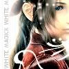
^_^ I noticed that there wasn't just one thread for Final Fantasy fanart for people to post up - just a lot of individual threads, so I thought I'd make this. So, yeah. Here's a thread for posting your own FF fanart, fanart you like, or asking questions in general about anything artsy.  So, I'll get the ball rolling. I have one FFVII piece I'd like to share.  It can be seen a Yuffentine or Yuffie/Vincent-friendship. This is the second time I've used my tablet. Uhh... comments or critique verymuchso welcome. :3 Anyone else? |
|
|
|
Post by Pen Against Sword on Jun 19, 2008 16:01:58 GMT
La, I envy your grasp on color and your unique, distinctive style.
-whine- I neeeed a tableeeet.
Anyway, Mengde and I were talking about this last night (and he's no artist and can't draw worth a fig so he didn't have much criticism to offer), but I wanted to say I really love their faces. Vincent's expression is sort of perplexed, like "What is she doing to me now?" and I love that. And Yuffie's sort of halfway smiling, halfway concentrating.
Also, the angle you've done it at makes it clear they're doing a myspace shot. (LAWLZ)
The only thing I can think of is that it looks as though Yuffie's right arm might be a little too short, the way it's coming straight down off of Vincent's shoulder. And I'm probably wrong on that anyway because I can't critique art to save my life.
|
|
|
|
Post by Sylla on Jun 19, 2008 16:59:38 GMT
Wow, that's sweet to the point where I might have to brush my teeth now. =P So first let me say I find your style of drawing absolutely adorable, and I love the way you draw hair. XD Hm, my only real piece of concrit here is (apart from what Pen said) the perspective on Yuffie's left arm seems kinda weird - looking at her torso, it's facing the front rather that turned to the side, so her shoulder should be further away from her neck. Apart from that, though, it looks great - and I love the color. Very bright and vibrant.  Also, Vincent looks like he's desperately trying not to smile at Yuffie's antics. D'aawwwww. =P Oh, and one more thing. Did you also draw your avatar? Because I luffs it.  |
|
|
|
Post by La Editor on Jun 22, 2008 1:58:03 GMT
Dwaaaa you guys are too nice :3 Yuffie's arm IS a bit weird. Oh well, I'll just keep practicing. I think the one thing that really, really bothers me is that the colors really aren't vibrant in comparison to what they were in photoshop - its like they dimmed. D: Like, there was more of a yellow glow. Argh. I think I'll end up just taking screencaps of it to get the right color. Or something.
Ahaha, as much as I wish I DID draw my avatar... I didn't >.< I was just looking for an avatar to use on google and found this. I really wish I knew where, it was such a long time ago and I didn't even think to write the site name down. LOL. D: I think I chose it because of my immense love for Aeris. (I refuse to use Aerith. NEVAR.) XD
|
|
|
|
Post by Sylla on Jun 22, 2008 9:00:10 GMT
Aeris! Amen to that! I don't like to use Aerith, either (though I occasionally make an exception to differentiate between FFVII Aeris and KH Aeris, whom I then call Aerith). =P And if you want to see vibrant colors, I suggest you learn from the master. Seriously, EYE BLINDINGLY BRIGHT. |
|
|
|
Post by stellaluna on Jun 26, 2008 6:58:42 GMT
Wow, I love your style. I envy it...I always tend to make my drawings too detailed. I envy the people who can draw a few lines and make it suggestive, and have it be a picture. I just have to sketch everything out. Very clean style. Have you seen my style? It's like chicken scratch. As for the colors, it looks sort of watercolory-ish. So...not that bad. Also, I need to work on drawing cartoon humans. |
|
|
|
Post by Sylla on Jun 28, 2008 20:37:48 GMT
Okay, so. Next in the line of 'Sylla's retarded WiPs', we have:  So, Yuna and an OC from that FFX fic I'm thinking of. Actually, it's a fairly good example of how I color on the computer: lineart in pencil in my sketchbook, and then I scan it and go wild in Gimp. =P And Stella, I like the detailed/chicken-scratch style. It's one of my favorites. Unfortunately, most of the time my drawings either turn out freakishly neat, or just messy looking. XD |
|
|
|
Post by La Editor on Jun 29, 2008 21:57:50 GMT
=D That's really good! I absolutely, without a doubt cannot do hair to save my life. Especially highlights, Yuna's hair is just gorgeous! -envyenvyenvy- XD
The only thing is their necks - Yuna's in particular. It's a bit too thick, and a bit too long. Personally, I would have cut the neck off at about your OC's cheek, and thinned it to a line straight down from the curve of her bottom eyelids. That's really it - the coloring is just awesome, Sylla. I have Gimp-envy. :3
|
|
|
|
Post by Sylla on Jun 30, 2008 10:48:17 GMT
Aw, thanks. ;D
Heheh, you're absolutely right, La - Yuna's neck is too thick on the left side (already corrected) and a bit too long (eh, I'll figure it out somehow). The actual sketch is from a period when, for some reason, I started to draw really long necks, dunno why. XD
Anyhow, the reason I like this one in particular is the painting-like feel it has to it. The colors are less flat - and yes, the hair almost killed me. Do you know how hard it is to get hair to look realistic?! Also, my secret as to the colors? I character art picture of Yuna (you know, the watercolor ones that just show the characters' head and shoulders); Gimp lets you take colors from that. (Woohoo!)
Also, I worked my butt off doing Yuna's eyes. Can you tell? =P
|
|
|
|
Post by Jeanneandheralters on Jun 30, 2008 11:02:40 GMT
*still staring at La's picture* I liiike it! *pokes* I like it a lot. Its got Yuffie in it! It also has Vincent, and thats always a plus. Not to say that that's the only reason I like it.
|
|
|
|
Post by La Editor on Jul 3, 2008 18:54:09 GMT
XD Thank you!
Neh, neh, does anyone have any Seymour fanart? I haven't seen much. ;__; Nobody loves poor Seymour, whom I could totally just eat up with candy and waffles.
|
|
|
|
Post by Sylla on Jul 3, 2008 21:03:35 GMT
Hm, I had a couple pieces but from waaaay back so if I found them now I'd probably just scrap them anyway. =P
... Now I feel like drawing some Seymour fanart. But no promises. XD
|
|
mku
Plate Dweller

Posts: 47 
|
Post by mku on Jul 4, 2008 1:17:56 GMT
In the first picture I just adore their expressions! (I especially love Vicent's <3) You pulled off their poses really nicely too. And their hair looks really nice, you have a cool way of doing highlights.
As for critique, I think creating a bit more contrast between the base and shade colours. And Yuffie's body might be a bit too small (I think this would be easier to tell if it was a full-body picture).
The CGing in the WIP is just cool. Yuna's hair is really nicely shaded and highlighted and so are her eyes. Again I think a bit of contrast between base and shade in her skin would look nice (as well as some difference in colour, so it isn't all just different shades of pink), but it's really up to you how much of it you want. And it's a small detail and depends a lot on the artist's style, but insteak of making the line that is defining her mouth black, it could be a darker shade of pink/red, a colour similar to her skintone but still very visible.
edit: True, I've never seen any Seymour fanart now that I think of it. Most I've done of him was a head picture just because I'd never drawn him so I don't have much of him either. ;_;
|
|
|
|
Post by Sylla on Jul 4, 2008 11:53:28 GMT
Again I think a bit of contrast between base and shade in her skin would look nice (as well as some difference in colour, so it isn't all just different shades of pink), but it's really up to you how much of it you want. And it's a small detail and depends a lot on the artist's style, but insteak of making the line that is defining her mouth black, it could be a darker shade of pink/red, a colour similar to her skintone but still very visible. Heh, thanks for the compliments and the crit. Y'know what, though? All the tones I used for her skin are from the original character art, so if she looks pink, that's why. ...Her skin was actually more pink when I first colored it, but I modified it a little. XD As for increasing the light-shadow difference, I agree. Hm, the contrast was bigger in Gimp... =P |
|
mku
Plate Dweller
Posts: 47
|
Post by mku on Jul 4, 2008 13:41:53 GMT
I see. The original character art uses soft-ish colours and the skin colours are mostly the same, I guess. The main difference is that using different shades of pink to colour her skin will give the painting a softer look while going for other colours would be a bit more realistic. Example -  (I used the same pink base colour for both here) It really depends on what you're aiming for I guess. |
|